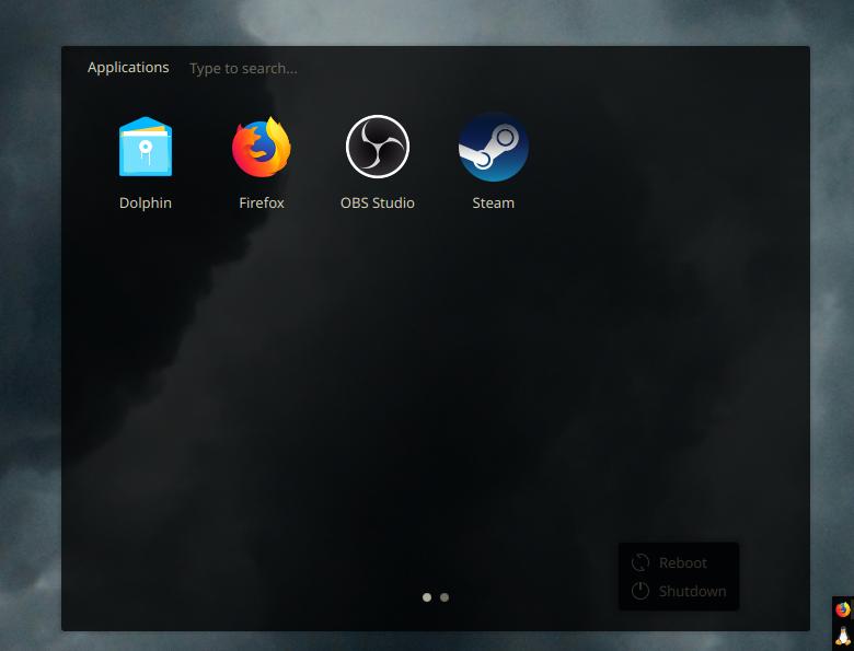
If anyone is wondering why I have an extra reboot/shutdown window, it’s because the menu I use for apps doesn’t have it and I don’t like the menus which do. :D

steal my look:
- 2 toolbars, 1 on top centered, 1 on right adjusted to the bottom, both made as short as they can be with 20px thickness
- top toolbar has Digital Clock and System Tray, bottom right toolbar has Icons Only Task Manager adjusted so new icons spawn on top and a “Minimal Menu” set to tux as the icon
- top toolbar set to floating, bottom right not
- both toolbars set to translucent and window go below (this is the most important for my setup to me)
- Breeze app style
- metadata toolbar (“Kanagawa KDE” in the store)
- Breeze Dark DeepDark colour variant
- Breeze window decoration
- default KDE fonts
- Keepin icons theme (I change it around a lot, but it’s my current fav)
- DeepinDark Cursors (alt: BreezeX-Black)
- Compact Shutdown Settings for the window on my desktop to be able to conviniently turn off / restart my PC
I use Plasma with a similar concept as yours, with two bars serving the same purposes.
My vertical icons-only bar goes in the lower-left, has chunkier, more glance-able icons (since pixels on the x-axis are plentiful) and this bar reserves its space from maximized windows. Think part WindowMaker/NextStep and part Unity.
Then a fully-opaque longer horizontal bar in the top-right with tray icons, a clock and a few hardware toggle widgets. Critically, like yours this toolbar stays on top of all windows (to make better use of my y-axis pixels), and my window decorations have left-aligned buttons and titles so max-height windows rarely have their titles cut off by the bar.
fully-opaque
How did you achieve this? Custom code?
Nope, just saying I don’t use any transparency for my panels. I don’t mind it overlapping and hiding part of the window bar because the important stuff is all on the left side of the bar.
Sorry, I’m just a dummy and my brain sometimes swaps the meanins of opaque and transparent in my head. xd
Hah! All good, I know exactly what that one feels like!
My OCD can’t stand the shutdown/reboot buttons just floating there. I would just use the terminal for reboot/shutdown.
Idk I prefer one panel. Never been a fan of docks and that kind of stuff. Still that’s a nice setup. Though -2 points for separate power menu. 7/10

